Case Studies

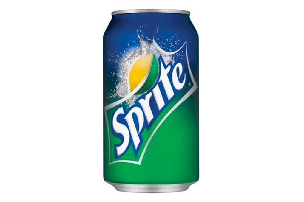
Client: TURNER DUCKWORTH (San Francisco)

From visuals supplied David was asked to draw 2 versions of the new Sprite logo for both the US and UK markets. These were released in 2011 in both regions with continuing success, going on to produce ‘ZERO’ versions for Fanta, Mellow Yello and other COCA COLA drinks products.

Client: LEO BURNETT (London)

From just six scribbled characters David created an alphabet for JUSROL pastry, which was used as the logo and all headers in national Advertising Campaigns, going on to win the prestigeous Pegasus award for type design and type usage.

Client: PI GLOBAL (London)

To commemorate the centenary of Marmite production, David was briefed to hand draw a facsimile version of the iconic 1920’s jar label. Produced in only UK and South Africa. Currently selling upwards of 25 million jars per year.

Clients: JKR . LOEWY . COWAN (London)

From roughs supplied, David created the alphabet and font he named ‘Souper’ for HEINZ SOUPS globally. Developing this instantly recognisable brand. He has drawn many Heinz product logos including the iconic “Tomato Ketchup”, “Big Soup” range, and the more recent “Taste of home” steamed Puddings range.

Client: HASBRO (Europe)

David was given a brief to take this long existing logo and bring it forward in time and re-balance the letterforms, but retaining the original colours, feel and instant recognition. This has been implemented for the whole US American market.

Client: WRIGLEYS (Chicago)

The brief was given to David to re-think the existing JUICY FRUIT logo, evolution not revolution, after submitting evolution roughs he also threw some revolution which became the chosen route forward. The product was originally first introduced to the American market in the 1930s.

Client: M&C SAATCHI (London)

The brief was to take the original six letters of the Turkish Tourist Board logo, then to draw an alphabet with many alternative letters in the same style to use in all languages for full international usage. It has now been used in excess of fifteen languages.

Client: PARKER WILLIAMS (London)

Parker Williams asked David to design, draw and craft a free-hand script then digitise it in Illustrator to be used over the whole of the Sainsbury’s Premium Foods range. Since it’s implementation the market share has increased significantly to top the £1 billion mark.

Client: HASBRO (Europe)

This alphabet developed by accident. After a request to draw a logo from a few rough letters supplied, David drew a full alphabet for his own personal use which he thought may come in handy. Sometime later his client asked to use this alphabet to be translated into several extra languages for more logos.

Client: TURNER DUCKWORTH (London)

David’s Client originally wanted to use a similar font so correctly asked the original font creator to redraw it to new proportions, weights and character changes, but was refused, the client then requested David to redraw it with no infringement of copyright. This he did, and was then asked to redraw it in nineteen languages, including both Russian and Greek Cyrillics and one version in South Korean, with each font in two weights.

Client: GOLD GREENLEES TROTT

From the five very rough characters supplied to him, David’s project was to produce a logo and an alphabet in both upper and lower case numerals with all puctuation and diacritics for Cadbury’s Wispa, this was in 1981. The product was discontinued some years later and such was the demand for this chocolate bar that the re-introduction was initiated in 2008 and the luxury Wispa Gold version in 2011, again using the original style which has become the iconic Wispa logo.

Client: PARKER WILLIAMS

 David was asked to redraw a new version of that already well known Branston logo, requirements were to update and refresh the exisisting marque.