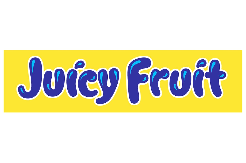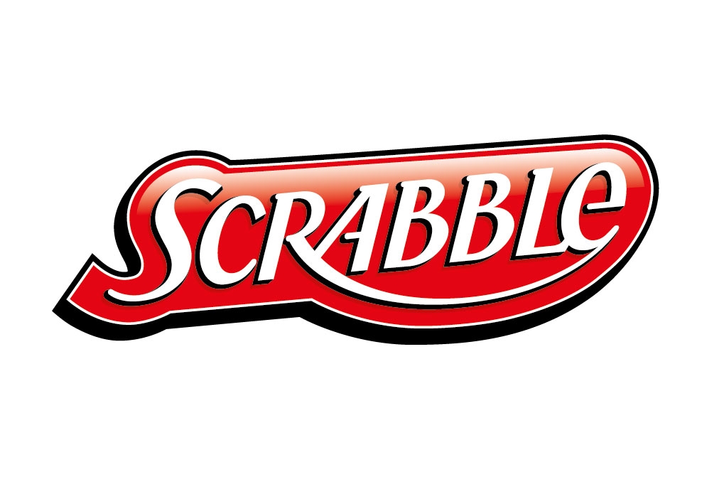
Client: HASBRO (Europe)
David was given a brief to take this long existing logo and bring it forward in time and re-balance the letterforms, but retaining the original colours, feel and instant recognition. This has been implemented for the whole US American market.